
What makes popcorn a beloved snack beyond its flavor and crunchiness? How can unique packaging enhance customer attraction and satisfaction in today’s competitive market?
1.The Importance of Popcorn Design
Familiarity boosts the return on investment for advertising and design, especially for iconic items like popcorn, which is associated with celebrations and movie gatherings. Designers should capitalize on this opportunity.
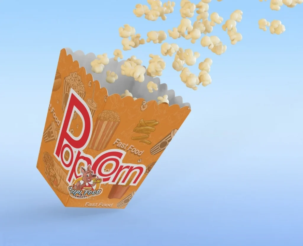
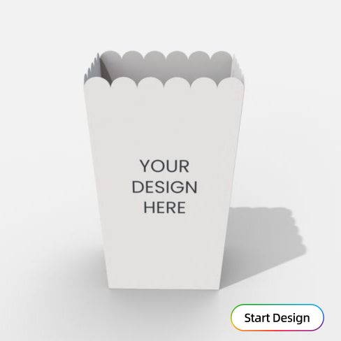
2.Key Components of Popcorn Design
A comprehensive popcorn design should include:
- Packaging Design: Attractive packaging that embodies the brand and targets the audience.
- Flavor Representation: Visuals and descriptions that highlight available flavors.
- Brand Logo and Tagline: A memorable logo and catchy tagline that define the brand.
- Nutritional Information: Easy-to-read nutritional content for health-conscious consumers.
- Sustainability Messaging: Information on eco-friendly practices, if relevant.
3.How to Design Popcorn Packaging
3-1 Market Research
- Identify target audience preferences and behaviors.
- Analyze competitors’ packaging and branding strategies.
3-2 Professional Graphic Design
- Hire a designer to create an aesthetically appealing package.
- Ensure design aligns with brand identity.
3-3 Color Psychology
- Use bright colors to attract attention and evoke fun.
- Be mindful of how colors influence emotional responses.
3-4 Practical Considerations
- Focus on packaging durability and ease of handling.
- Consider materials that keep popcorn fresh.
4.Exploring Creative Design Elements in Popcorn Packaging
4-1 Color Elements
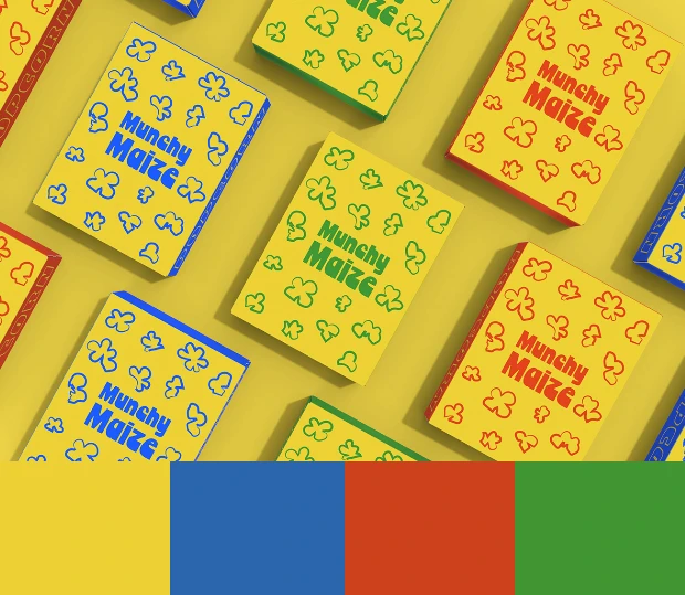
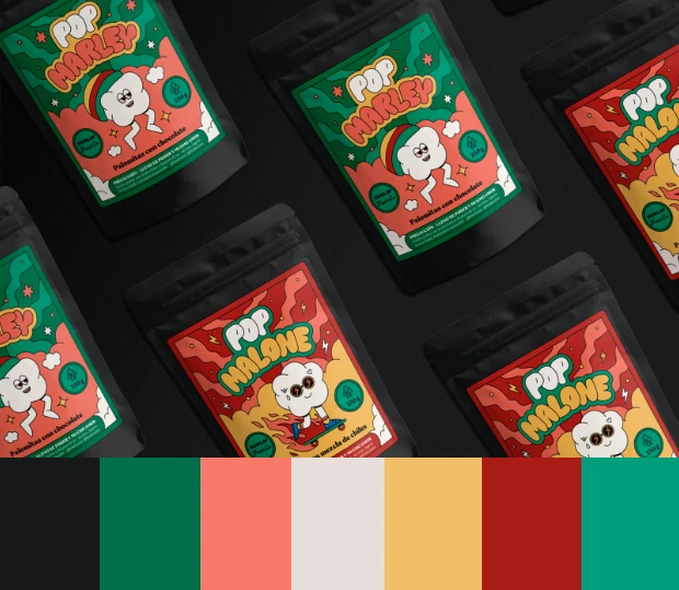
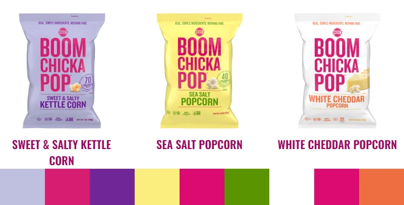

I’ve extracted the theme colors from the packaging images and listed them under each picture for your reference. You can use this format to collect your own color schemes as well.
Choosing a primary color for packaging conveys the brand’s personality and should align with its image and product characteristics for high recognizability. Accent colors can enrich the design by complementing the primary hue, highlighting key elements and enhancing the overall visual effect.
- A good package design is highly dependent on an outstanding color scheme, which plays a crucial visual role.
4-2 Graphic Elements
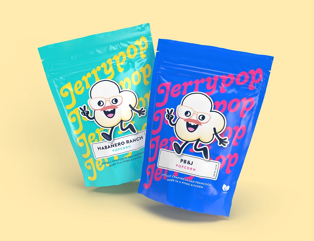
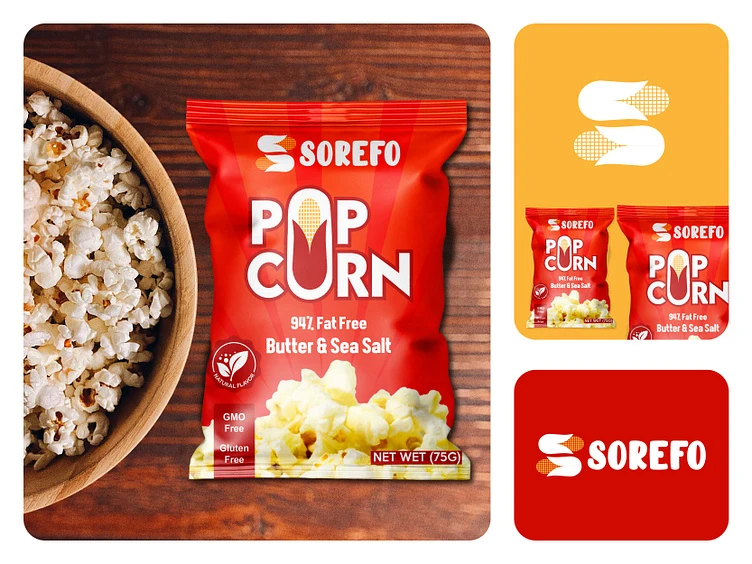
Decorative graphics like patterns and designs can enhance packaging aesthetics and resonate with brand identity. The upper left graphic personifies popcorn, while the right creatively transforms the letter “O” into a corn design, both leaving a memorable impression on consumers.
- In terms of graphic elements, unique brand elements can be created, such as custom graphics and cute cartoon characters.
4-3 Text Elements
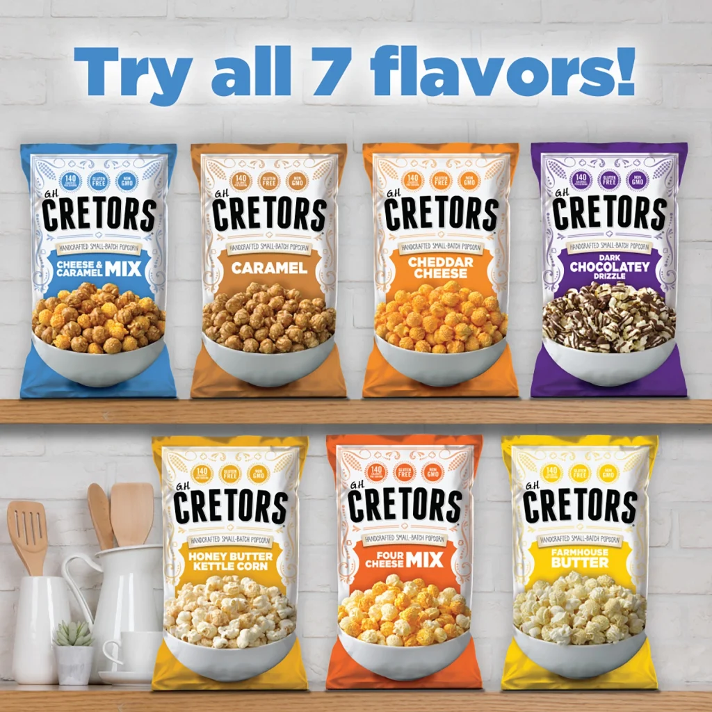
The brand name is one of the most important text elements on packaging. It should be concise, memorable, and distinctive. Cretors’ popcorn brand packaging exemplifies these qualities. The brand slogan “Handcrafted small batch popcorn” effectively conveys the product’s advantages and characteristics.
- In terms of innovation in text, it can involve using large characters or various special and unique symbols that reflect brand value. These characters can become distinctive words that embody the brand’s characteristics.
4-4 Material Elements
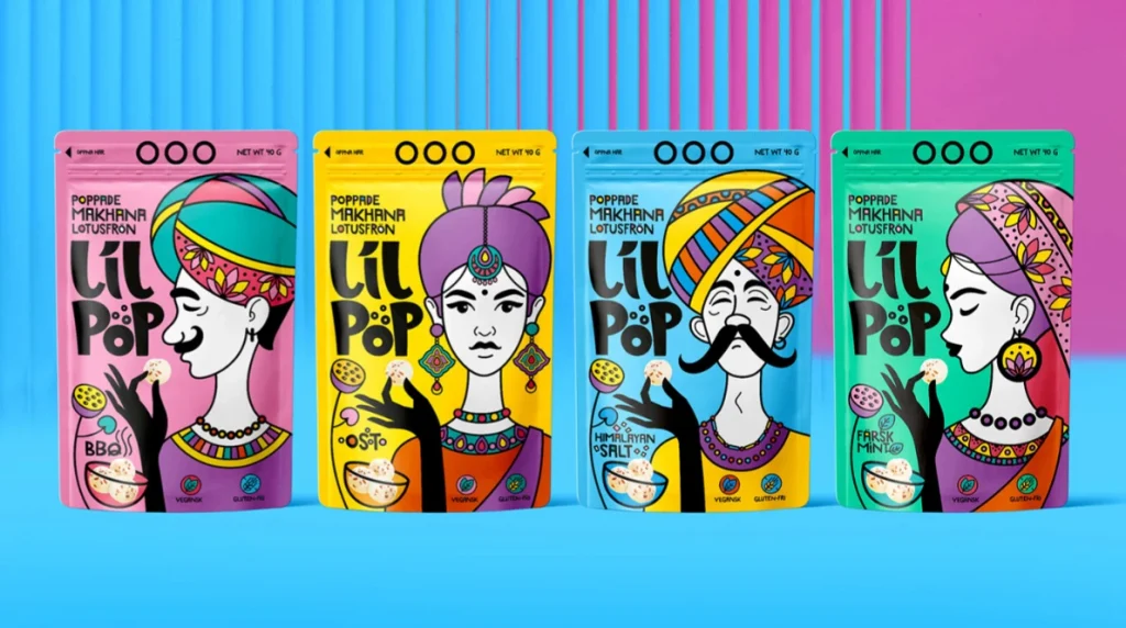
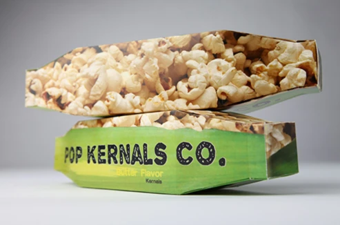
The choice of packaging materials significantly affects its appearance and protective performance, with smoother, structured options conveying higher quality. Consumers tend to favor stiffer materials, which can enhance the overall appeal of the packaging design.
- In terms of materials, you can explore unconventional packaging options that people might not typically consider, transforming them into food-safe interiors. For instance, materials like snake skin bags or rice bags could be intriguing choices. Give it a try!
4-5 Spatial Elements
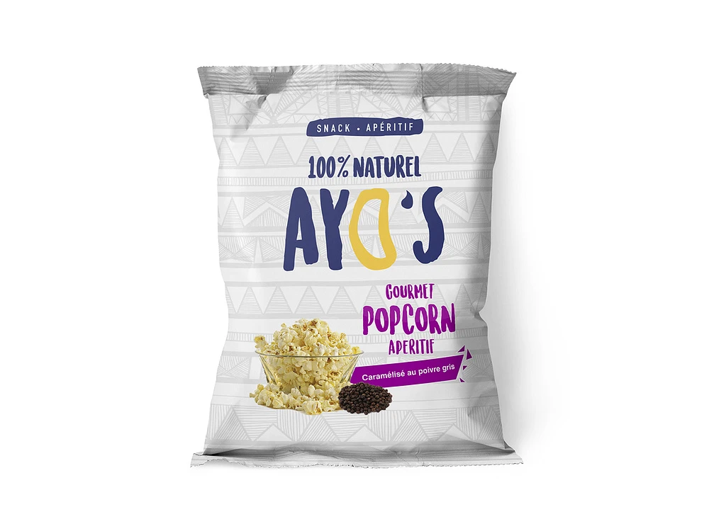
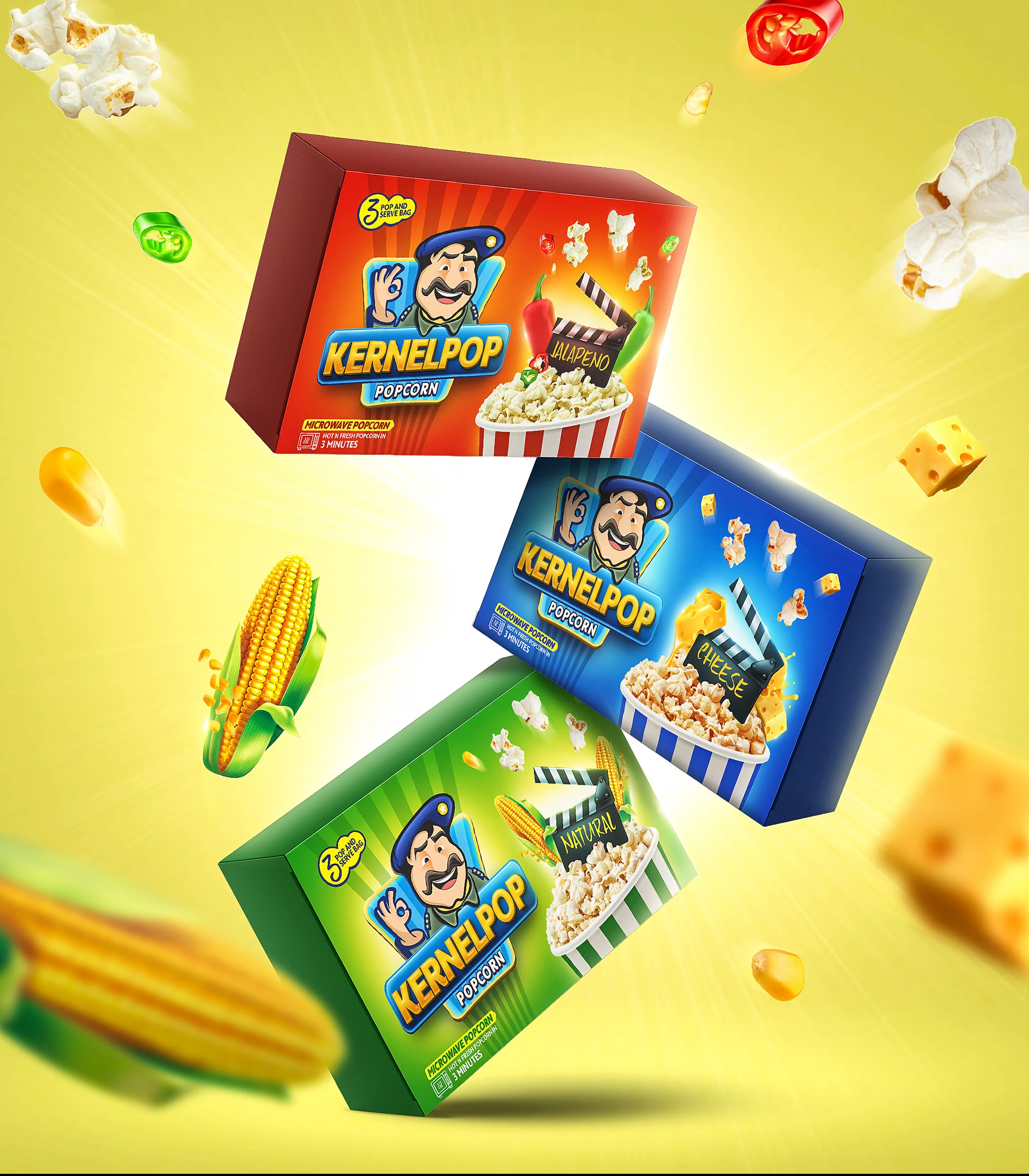
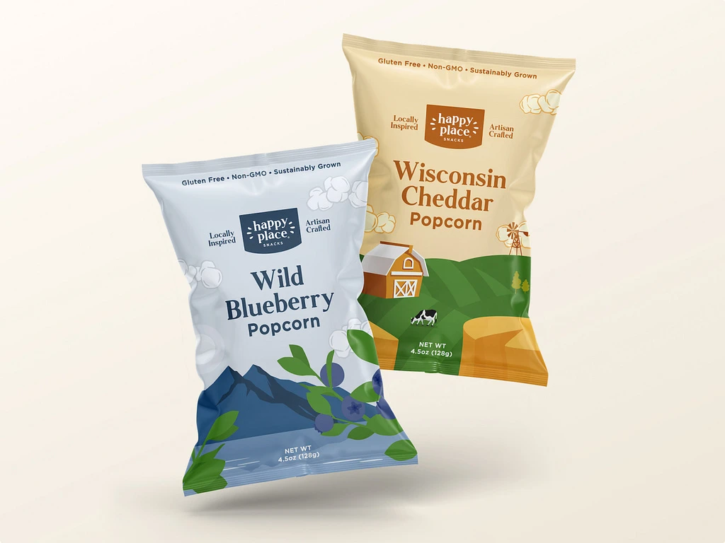
The shape and size of packaging should be designed based on the characteristics and needs of the product, ensuring that it facilitates storage and transportation while also attracting the attention of consumers.
- In addition, the packaging’s opening method provides consumers with a sense of ceremony, offering an easy entry point for breakthroughs. A successful interaction method is often novel, interesting, and unexpected.
The following content will primarily elaborate on some excellent packaging ideas, with a focus on the opening and usability aspects.
5.Designing Impactful Popcorn Packaging: A Focus on Shape and Function
Successful popcorn packaging design relies on ongoing consumer and competitor research while staying attuned to trends. Begin by evaluating the packaging’s opening method as a key aspect of your design process.
5-1 Multifunctional Box Wonders of Imagination
Understand your potential consumers’ needs and preferences to inform your choices of colors, fonts, and typography in packaging design. This approach will help you grab their attention quickly when they see your product on retail shelves.
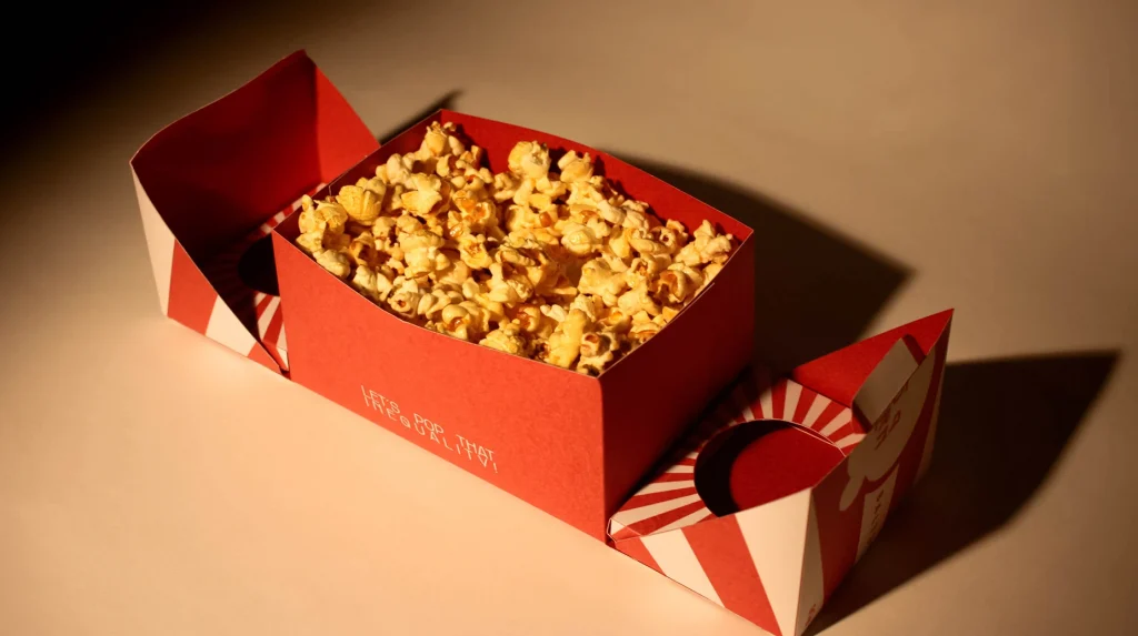
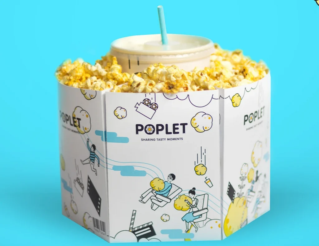
These two types of packaging can be classified within the same category. While consumers enjoy popcorn, the special design of the packaging also allows for drinks to be placed inside. This makes it very suitable for venues such as cinemas and amusement parks.
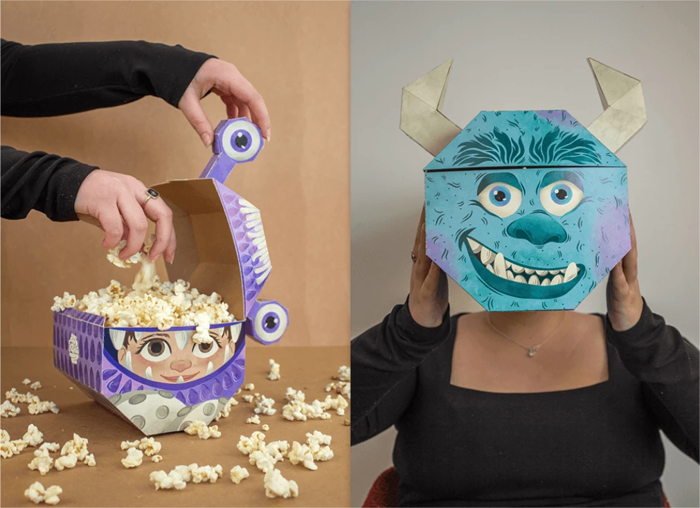
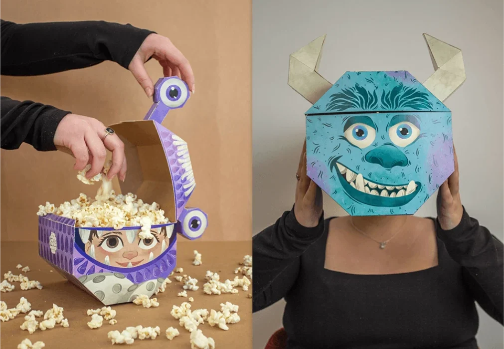
The third packaging design features a special cartoon-shaped head that stores popcorn. Once the popcorn is gone, it can be repurposed for entertainment. I believe it would make a great costume accessory for Halloween.
5-2 The Infinite Possibilities of Drawer-Style Creativity
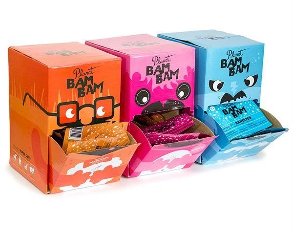
This drawer-style design preserves popcorn freshness. The opening is like a cute cartoon character’s mouth, adding fun. After popcorn is consumed, it can be used as a storage container for cat food, disposable gloves, etc.
(Credits:pinterest.com)
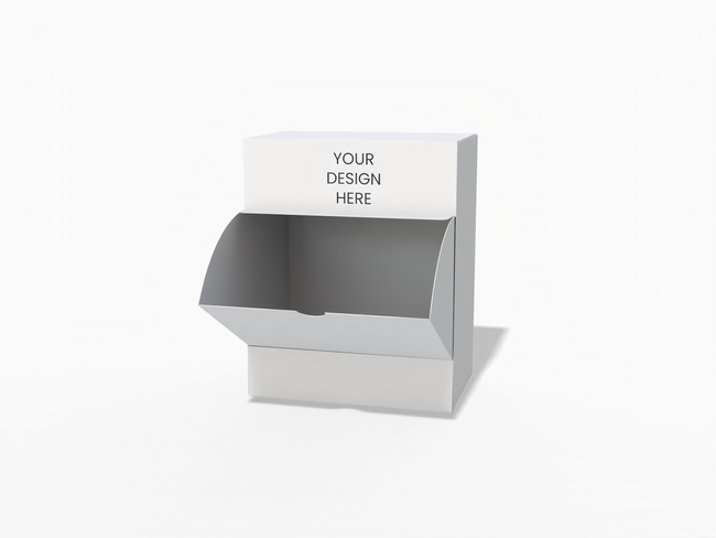
I have also discovered a comparable styling design on Pacdora. You can click on the picture to utilize it.
(Credits:pacdora.com)
5-3 Imagination Unlocks a New Realm of Design
By using your imagination about popcorn, you can create a more vivid design.
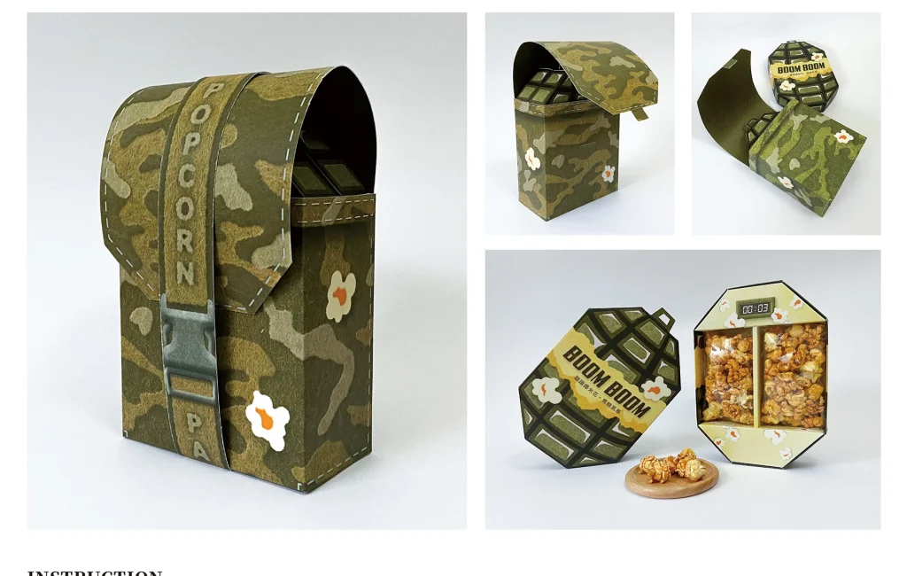
Through the imagination of popcorn ‘popping,’ someone has created popcorn packaging that resembles a grenade, which is very appealing to children. Additionally, considering that popcorn originated from corn, someone has designed popcorn packaging in the shape of corn.
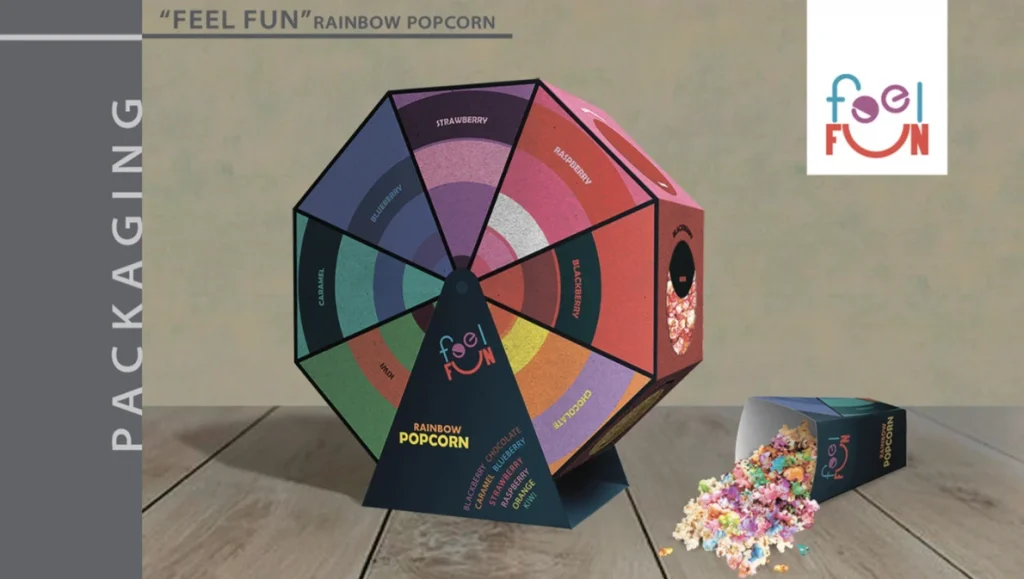
The design utilizes the theme of enjoying popcorn in an amusement park setting. Popcorn is packed into triangular pyramid-shaped boxes, which are then assembled into a Ferris wheel. This design is perfect for occasions such as parties.
5-4 The Unique Charm of Window-Style Design
The window-style design allows people to clearly see the popcorn inside. The packaging effectively utilizes this feature. One design makes the exposed popcorn resemble a clown’s afro, while the second design places the exposed popcorn in the mouth of a cartoon character.
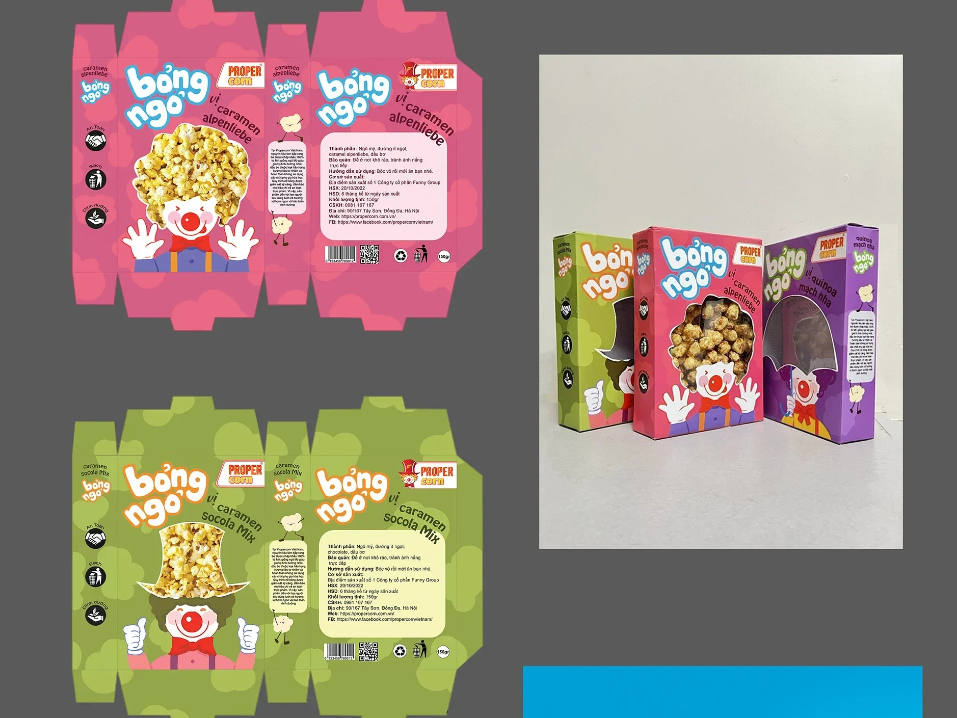
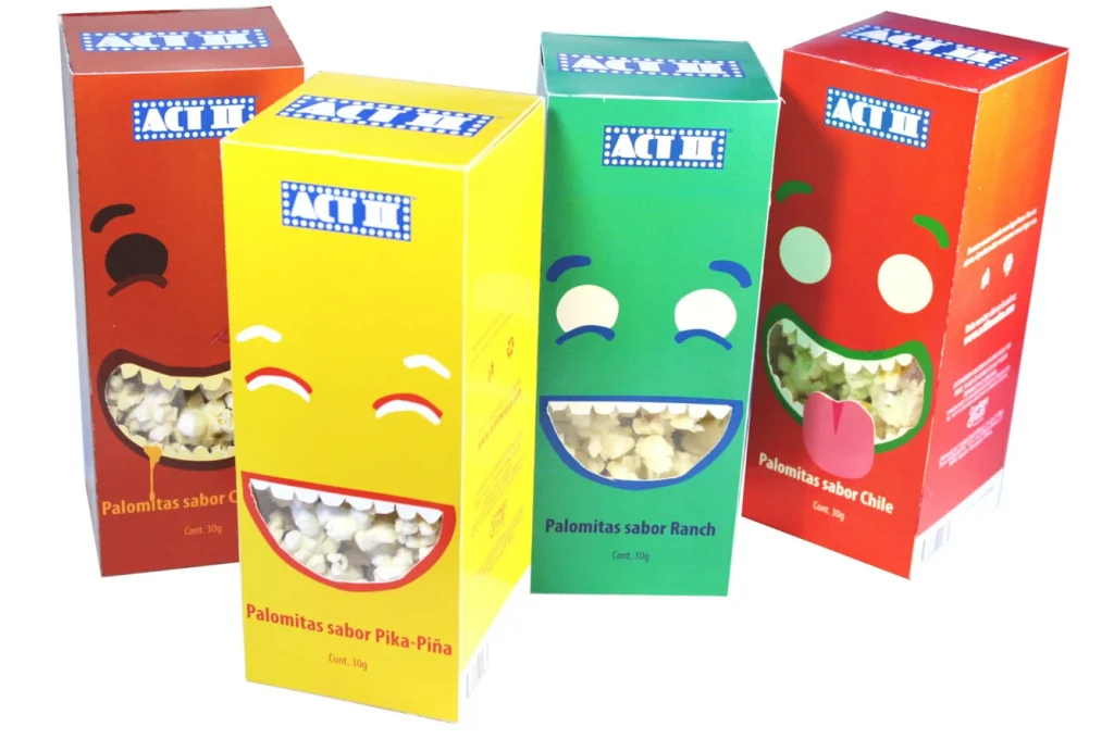
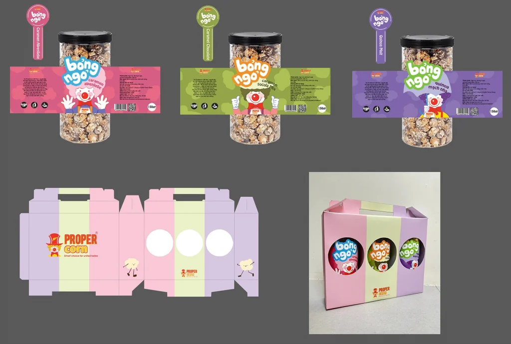
The third packaging does not showcase the popcorn itself. Instead, it features a beautiful visual design related to popcorn, presented through a simple box that resembles a display cabinet.
6.Examining the diverse applications of popcorn, a cherished treat.
6-1 Home Entertainment
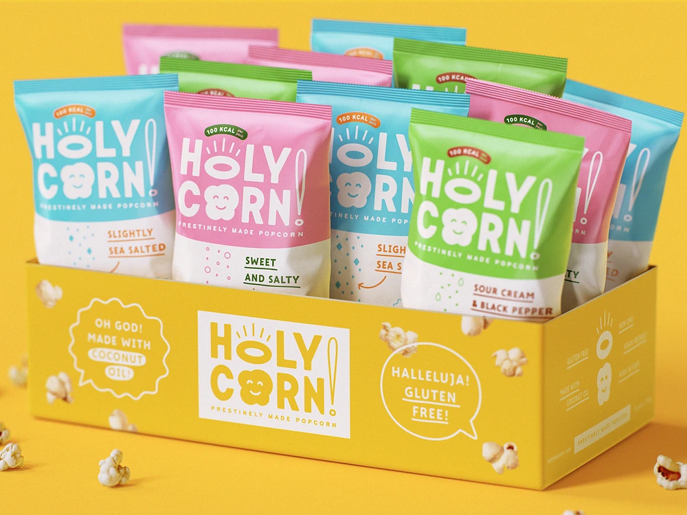
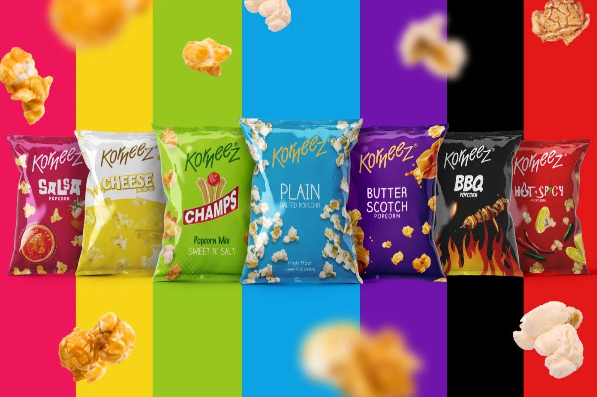
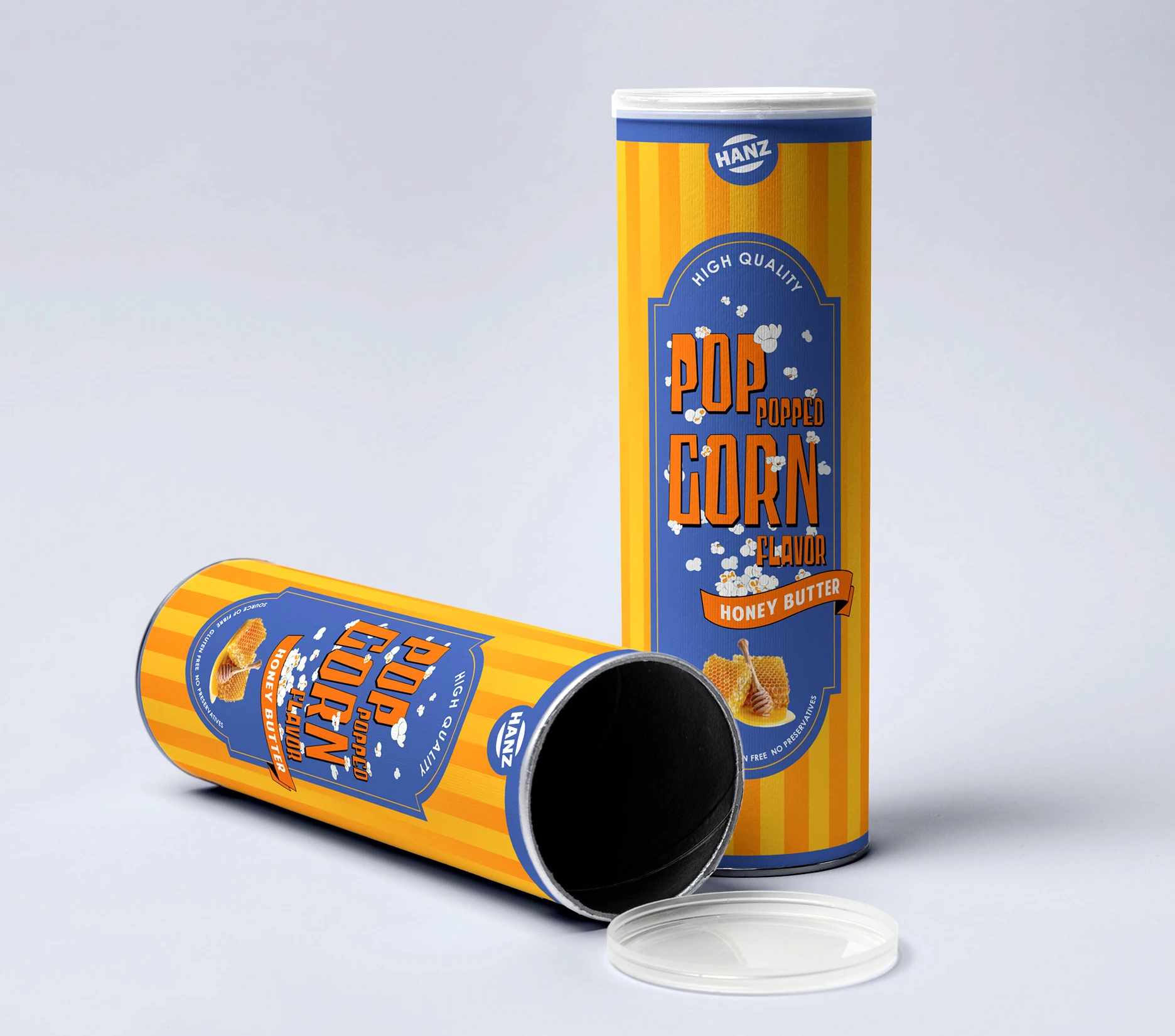
Bagged popcorn is easy to carry and is commonly seen in family gatherings. This kind of packaging needs eye-catching color combinations and clear descriptions of flavors so that it is easier for people who are going to attend family gatherings to purchase it on the shelves.
6-2 Social Gatherings
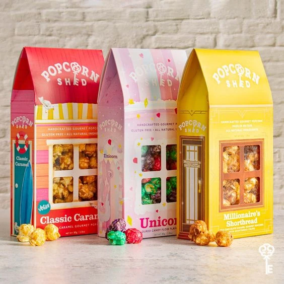
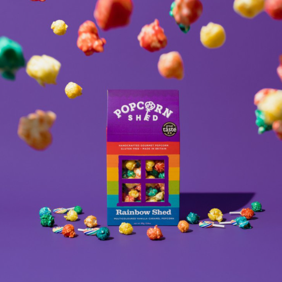
If your popcorn marketing strategy focuses on social gatherings, gable boxes are an ideal choice. Make the most of the experience of the quality time your consumers spend indulging in fresh popcorn of your brand through the packaging design. Rest assured that your popcorn will become the most popular choice for consumers.
6-3 Present Perfection
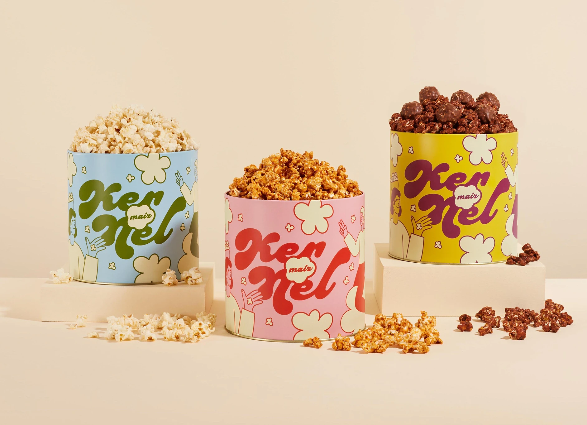
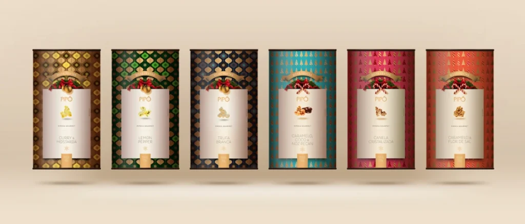
Tin packaging is ideal for gifts, providing excellent sealing to maintain the crispness and flavor of popcorn. Its luxurious design and reusability make it a popular choice for gifting.
6-4 Carnivals
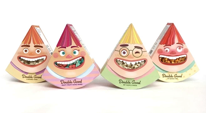
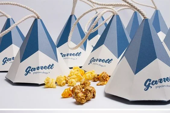
Popcorn packaging applied in such usage scenarios usually needs to be highly creative and interesting. At the same time, it has eye-catching vibrant colors and looks like an exquisite gift.
6-5 Movie Theater
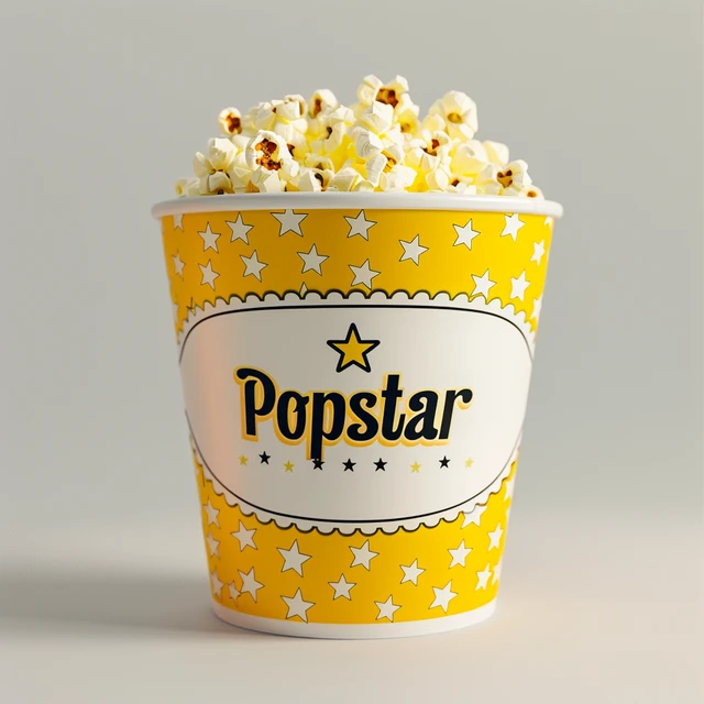
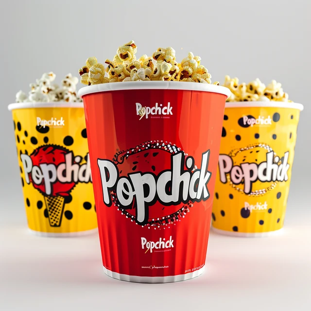
Barreled popcorn packaging in movie theaters typically features simple colors and a prominent brand logo. To enhance visual appeal, elements like polka dots or stars can be incorporated into the design.
Conclusion
1. Design Methods and Approaches.
- Our design primarily focuses on several aspects: color elements, graphic elements, text elements, material elements, and spatial elements. We then incorporate imagination and extension into the design process.
- Let’s choose a specific entry point: spatial elements, particularly opening methods. The structures of windows, doors, drawers, and other openable features can serve as inspiration for re-creation.
- Additionally, it is crucial to consider the usage scenarios for popcorn packaging. The effectiveness of your design can only be maximized when the appropriate packaging is matched with the right scenario.
2. The source websites of the materials in the text. If needed, you can directly click the link to visit.
3. Recommended design tools:
- 3D packaging design tool – Pacdora
- AI design and shooting tool – Packify.ai.
Subscribe to us and let us know which creative design ideas for products you’d like us to provide next. We’ll create the tutorials just for you.
FAQs on Popcorn Packaging Ideas
- How can alluring popcorn packaging design entice customers?
You can design by focusing on color elements, graphic elements, text elements, material elements, and spatial elements.
- How can innovative popcorn packaging concepts enhance the visibility of my brand?
Unique packaging captivates attention, fosters customer confidence, and promotes social sharing, which in turn enhances brand visibility.
- What Are the Keys to Popcorn Packaging?
The key to popcorn packaging lies in protecting the product, preserving and extending shelf life, and providing a great user experience.
- Are QR codes effective when used on popcorn packaging?
Yes,QR codes enhance customer interaction by offering exclusive deals and engaging activities, boosting brand connection.


Thank you for writing this post!
Thanks for posting. I really enjoyed reading it, especially because it addressed my problem. It helped me a lot and I hope it will help others too.
Post útil! A vetorização de logo faz toda a diferença para uma identidade visual profissional.
Adorei! Vetorizar logo é o melhor caminho para garantir que sua marca se destaque em qualquer material.
Ótimo post! A vetorização de logo é essencial para manter a qualidade em qualquer tamanho de mídia.
Excelente dica! A vetorização de imagem é fundamental para quem precisa de flexibilidade no design.
Thanks for posting. I really enjoyed reading it, especially because it addressed my problem. It helped me a lot and I hope it will help others too.
Concordo! Vetorizar imagem garante que a arte fique nítida, não importa o quanto seja ampliada.
I want to thank you for your assistance and this post. It’s been great.
Thanks for posting. I really enjoyed reading it, especially because it addressed my problem. It helped me a lot and I hope it will help others too.
Your articles are very helpful to me. May I request more information?
You helped me a lot by posting this article and I love what I’m learning.
The articles you write help me a lot and I like the topic
Thank you for your help and this post. It’s been great.
You’ve been great to me. Thank you!
I’d like to find out more? I’d love to find out more details.
How can I find out more about it?
Hi there, I enjooy reading all of your article post.
I wanted to write a little comment to support you. https://evolution.org.ua/
Thank you for your articles. They are very helpful to me. May I ask you a question?
Can you write more about it? Your articles are always helpful to me. Thank you!
The articles you write help me a lot and I like the topic
Thank you for your articles. They are very helpful to me. May I ask you a question?
May I request that you elaborate on that? Your posts have been extremely helpful to me. Thank you!
Can you write more about it? Your articles are always helpful to me. Thank you!
May I have information on the topic of your article?
I enjoyed reading your piece and it provided me with a lot of value.
The articles you write help me a lot and I like the topic
Thank you for writing this article. I appreciate the subject too.
You helped me a lot by posting this article and I love what I’m learning.
Hi my friend! I want to say that this article is amazing, nice written and include approximately all important infos. I would like to see more posts like this.
Hello there, simply became alert to your weblog through Google, and located that it’s truly informative. I抦 going to be careful for brussels. I抣l be grateful should you proceed this in future. Many people will likely be benefited out of your writing. Cheers!
Hello! This is my 1st comment here so I just wanted to give a quick shout out and tell you I truly enjoy reading through your articles. Can you recommend any other blogs/websites/forums that deal with the same topics? Appreciate it!
This design is incredible! You certainly know how to keep a reader entertained. Between your wit and your videos, I was almost moved to start my own blog (well, almost…HaHa!) Wonderful job. I really enjoyed what you had to say, and more than that, how you presented it. Too cool!